


")
Logos are more than just something you use to spruce up your website, brand communications and marketing campaigns. Your logo is your visual identity, simplified and refined into a simple yet effective icon.
In this crowded world of competing companies, brand logos can be the element that captures the eye of your intended audience, inspires loyalty, and ensures that you continue to generate sales, no matter how saturated your niche might become.
While designing logos requires a creative mind and execution team, we rarely know what goes on behind designing a brand logo. Today we have decided to give you an insight into some of the most memorable brand marks and how they were designed.
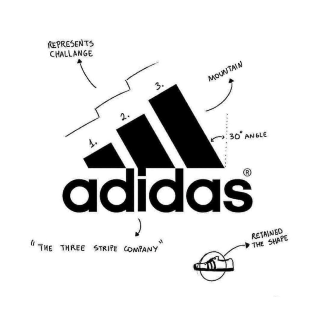
1. Adidas
The Adidas logo shows how growth is presented with a linear graph rather than a perpendicular. The steps represent challenges which must be tackled step by step to achieve growth and success. The three-bar logo is the signature design on the majority of Adidas merchandise. Meanwhile, the thirty-degree angle represents a mountain and what it means to achieve fame as an athlete.
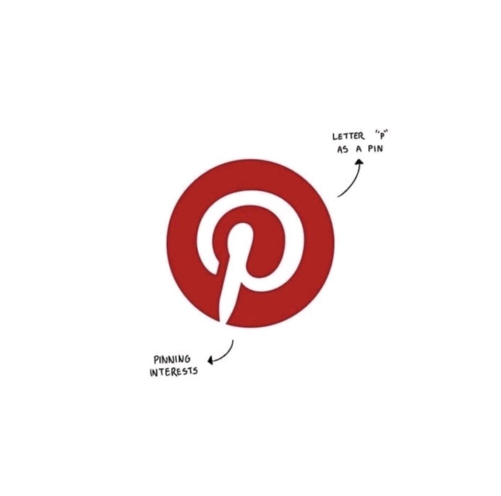
2. Pinterest
The Pinterest logo designed in a pin form suggests the availability of the pin option, which allows users to pin their favorite images and files. The P in the logo represents a pushpin in real life which is given a digital aspect on a digital platform.
Read More: 6 Shopping Hacks To Save More During Inflation
3. Amazon
Amazon is a powerhouse for online shopping, and its logo reflects that. The yellow arrow in their logo starts at the letter A and ends at the letter Z, implying that they sell everything from a to z. The arrow also represents a smile, with the arrowhead being a stylized dimple or smile line. The smile indicates the happiness people feel when they shop with Amazon.

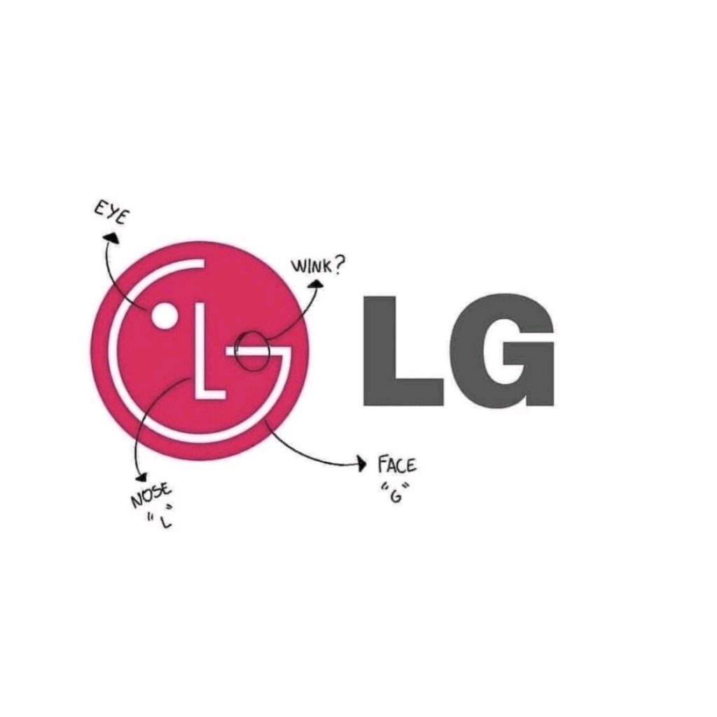
4. L.G
LG is recognized worldwide, and most people recognize the ‘L’ and ‘G’ in the logo. What most people don’t realize, though, is that those letters help to create a face. The ‘L’ makes the nose, and the ‘G’ makes up the rest of the face. This gives the brand a human element and makes it more inviting and approachable.
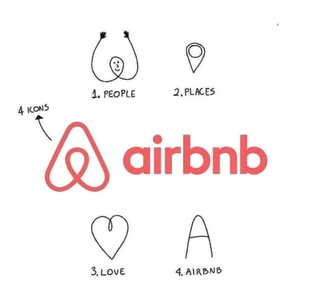
5. Airbnb
The interesting-looking symbol that makes up the bulk of the current Airbnb logo design is actually a combination of four other symbols. The teardrop shape at the center of the symbol is meant to be a person’s head, conveying the idea that Airbnb is a people-oriented company. This same teardrop shape is also meant to represent the shape of a location icon – a symbol that people associate with travel and destinations. In addition to mimicking the first letter in the company’s name, the heart-shaped design of the outward symbol is also meant to be just what it looks like – a heart symbol that conveys the idea of love and compassion.
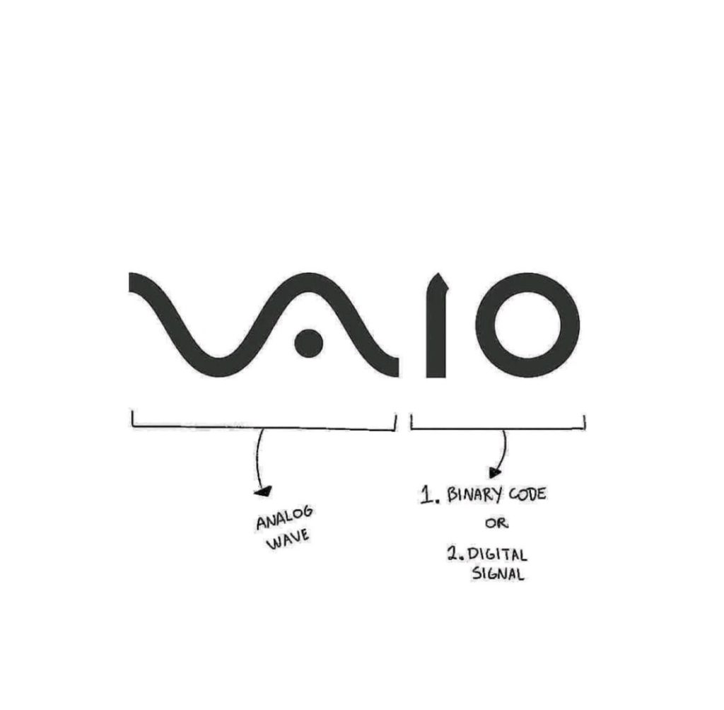
6. Vaio
Sony Vaio, aka Visual Audio Intelligent Organizer, is known worldwide for its technology, but not everyone knows the meaning behind its logo. Vaio represents the integration of both analog and digital technologies in its products. The letters ‘VA’ is made to look like an analog wave, while the ‘io’ resemble the numbers 1 and 0, representing a digital signal or binary code.
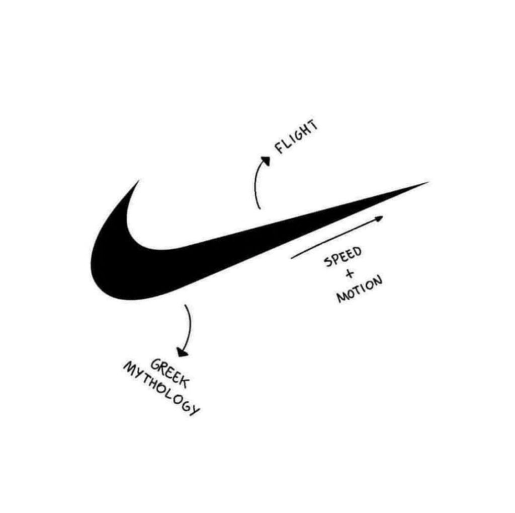
7. Nike
Nike’s logo always rings our ears with ‘Just do it. Implying in the logo, the swoosh mark is the classic Nike tagline just in the pictorial form. The swoosh mimics the wings of Nike, the goddess of victory in Greek mythology, and the company’s namesake. It also looks like a checkmark and signifies getting things done. With a fluid silhouette evoking motion and speed, you can see how much space there is to instil brand values into an abstract, minimal design.
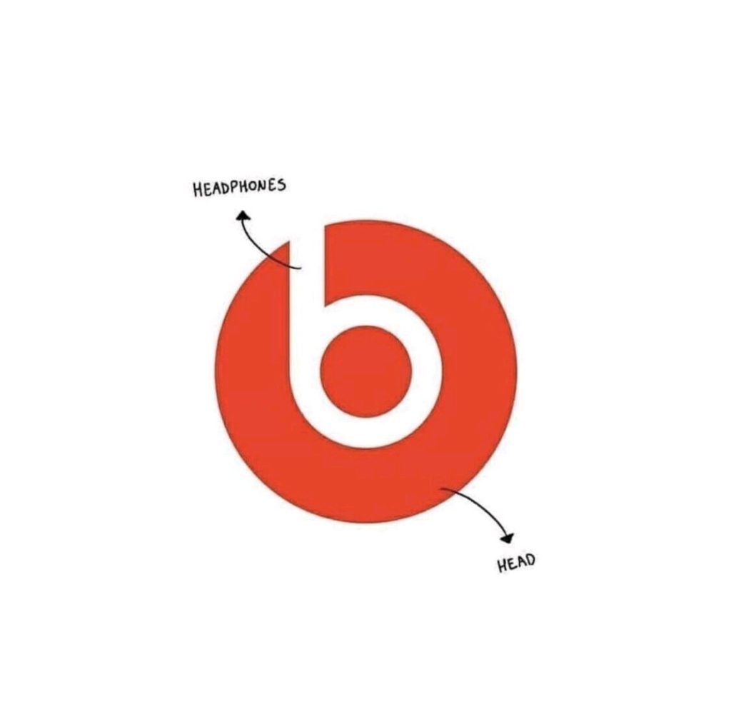
8. Beats
The logo for Beats by Dre is pretty simple. The ‘b’ is enclosed in a circle, followed by the brand name. The circle, though, isn’t just a circle. It represents a human’s head, and the ‘b’ letterform represents the brand’s headphones. This gives the brand a personal element, allowing a customer to see themselves in the headphones.
Read More: 6 Fool-Proof Ways To Save Money On Electronics
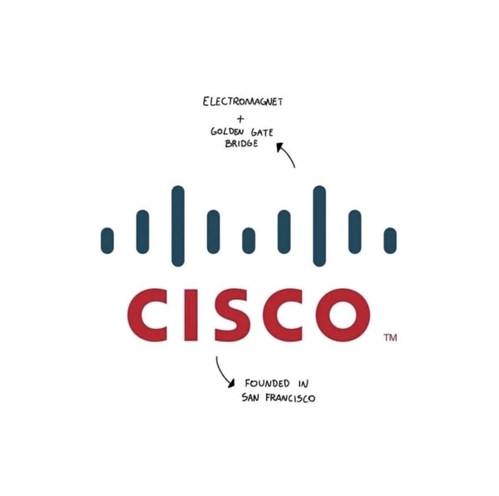
9. Cisco
Cisco, the worldwide leader in networking for the internet, is named after its headquarters in San Francisco. While its namesake doesn’t have a hidden meaning, the blue stripes above the logotype represent not only an electromagnet but also the Golden Gate Bridge.
Stay tuned to Brandsynario for the latest news and updates.