


")
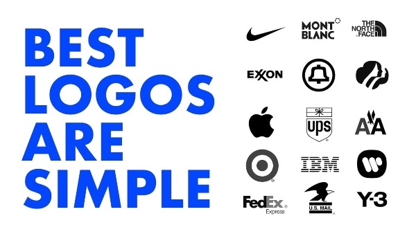
Brands are now turning towards a particular kind of logos that are interesting to look at and also holistically very similar. What’s with the minimal logos? The clean colours, cuts, and flattened features are giving rise to the ‘minimal’ logo age and many brands have started following suit. Kellogg’s is one of them, read about why!
Read more: New Study Shows Men Might Outlive Women
So, What Happened?
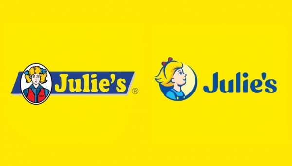
A while back, Julie’s Biscuits unveiled its new logo just after Pringles changed its identity. Besides those, many other businesses and products have flattened their logo elements too. The colour elements have become simplified. People are also noticing a reduction in intricate features and an increase in the usage of white space.
Should Brand Designers Consider This?
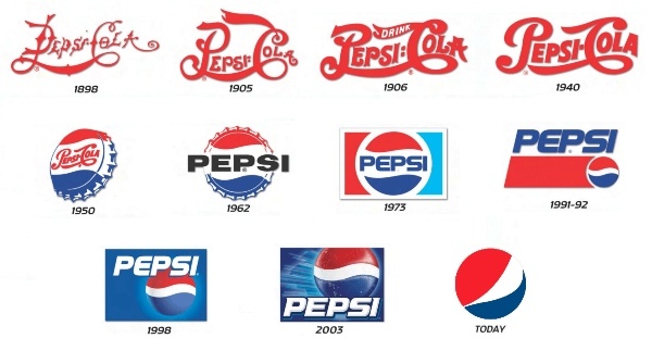
This trend is definitely one that brand designers should consider considering the day and age. Recently, for the first time in 20 years, Kellogg has updated the Pringles logo and packaging. They want to “showcase his new spectrum of emotions”.
How Did Kellogg’s Change?
For one, the well-groomed brown mustache of Mr. Pringles is now a black vector mustache. His chip-shaped face’s contour is gone, and his hair is replaced with black eyebrows. The Pringles cans have also been streamlined. Each flavor has its own background with separate solid colors and the chip and flavor images are less elaborate than before.
The reason behind this is that flattening Mr. Pringles’ distinctive characteristics makes the consumer pay more attention to the chips pictured on the cans. They can be appealed by the flavour.
How The Change Matters?
Previously, there was a time when complicated effects were common twenty years ago. Filters, gradients, transparency, lighting effects, 3D rendering, and intricate typefaces may all be added to a visual with only one click. Utilizing these meant a company was showing its cutting-edge skills and technological capability as a result.
However, these effects are now considered “retro” and “historical.” Such effects are already overused, and there is already too much visual data to process. The change in the logo and the cans now focus the attention only to the actual product rather than the branding. It helps people remember the product and engage with it better.
Read more: 7 Campaigns By Kitkat That Have Proved To Be Iconic
Stay tuned to Brandsynario for the latest news and updates.