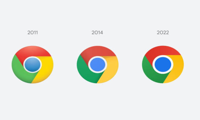
Google Chrome logo has been getting simpler since 2008 with the logo being tweaked in 2011 and 2014. The tech giant is now making subtle changes to the Chrome logo, as shared by Elvin Hu, a designer for Google Chrome.
Elvin Hu, a designer for Google Chrome, offers a first look at the logo’s redesign in a thread on Twitter.
“Some of you might have noticed a new icon in Chrome’s Canary update today. Yes! we’re refreshing Chrome’s brand icons for the first time in 8 years. The new icons will start to appear across your devices soon,” Hu said in a tweet.
Some of you might have noticed a new icon in Chrome’s Canary update today. Yes! we’re refreshing Chrome’s brand icons for the first time in 8 years. The new icons will start to appear across your devices soon. pic.twitter.com/aaaRRzFLI1
— Elvin 🌈 (@elvin_not_11) February 4, 2022
Read More: Queen Elizabeth’s Platinum Jubilee: A Complete Guide On The Celebrations
What’s New In The Logo?
The icon has been simplified/flattened by removing the shadows. The colours are brighter and the proportions are different, making the big blue ball in the middle noticeably bigger.
Another subtle change has been made to the colours of the logo. Avery subtle gradient to the main icon between the green and red colours to prevent “ unpleasant colour vibration.
We simplified the main brand icon by removing the shadows, refining the proportions and brightening the colors, to align with Google's more modern brand expression. pic.twitter.com/Hyig51gqJq
— Elvin 🌈 (@elvin_not_11) February 4, 2022
Google also is tweaking it further with different variations designed to look more at home on Windows, MacOS and iOS.
“We created OS-specific customizations. We want the icons to feel recognizably Chrome, but also well crafted for each OS. For example, on Windows, the icons take on an obviously gradated look, appearing at home on Windows 10 and 11,” Hu added.
Read More: How Do Shows On Netflix Earn Profits?
The new Google Chrome logo will be live for users across all devices with the release of Chrome 100 soon.
Explaining the reasoning behind the changes, Hu added, “You might ask, “why bother with something so subtle?”
“We tailor Chrome’s experience to each OS, with features like Native Window Occlusion on Windows, day-one M1 support on macOS, Widgets on iOS/Android, and Material You on Android. We want our brand to convey the same level of care.”
Stay tuned to Brandsynario for the latest news and updates.


