


The drink brand Fanta’s logo has been updated by the design team at Coca-Cola and the creative agency Jones Knowles Ritchie to give it a more cohesive, playful worldwide identity.
The Coca-Cola Company, the owner of the beverage brand Fanta, and Jones Knowles Ritchie worked together to rebrand the company to give it a youthful image that would appeal to consumers of all ages.
For the first time since its birth, Fanta has rebranded itself with a new worldwide identity as legacy companies like Pepsi change their logos in the middle of the summer.
Rebranding Of Fanta
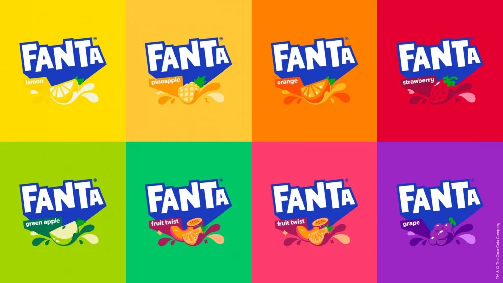
The brand has dropped the orange and the leaf from the backdrop. Leaning more forcefully and dramatically towards the blue of the previous logo. The orange background is being negated to demonstrate that the beverage contains flavors from all over the world that go beyond orange
“Fanta is one of the most playful brands we have in our portfolio. However, it was clear that the brand needed some TLC,” said the global vice president of design at The Coca-Cola Company Rapha Abreu.
“The identity was too contained and didn’t portray playfulness. At the same time, it felt geared toward a younger audience. Our audience is anyone that is playful at heart, and it was important that we brought the idea of fun and play to an older audience,” he added.
“At the end of the day, a playful brand needs to be truly playful.”
Read More: Pepsi’s 2023 Makeover: The Most Exciting Redesign In Years
“It was important that the new brand identity was an accurate reflection of the Fanta brand,” explained Abreu. “That meant making sure we were bringing every flavor to life. Take our old logo for example. It was confusing to have an orange in it when we have a range of flavors that go beyond orange,” he continued.
“We didn’t want the other flavors to be compromised even though we know that orange is the most iconic flavor.”
“Fanta has had many different changes over the years. However, the biggest challenge was that we wanted to stop that,” he said.
“We needed to crystalize it under one identity and stick with it for years to come. However, it was also about evolving what people love and know about Fanta,” he continued. “We didn’t want to throw away the old identity, we wanted to build upon it.”
Read More: Sprite’s Upside Down Billboard: A Deliberate Mess Up?
Stay tuned to Brandsynario for the latest news and updates.