Contributed by Hassan Wasti
Brands today are like any living organisms that grow and evolve with time. Like a living being, these world-renowned brands today have grown into a much more mature version of what they use to be, with time they have molded themselves according to the specifications and requirements of the passing era.
Have you ever stopped to wonder how some your favorite brands like Apple, Google, Nokia or Microsoft used to be 30 years back?
One of the defining factors of any brand is its logo it acts like a face of any brand and depicts what the brand is all about. Brands work tirelessly to make a logo that would best describe them and it is not an easy task that is why many logos that you see today are a product of years of hard work and brainstorming by top marketers in the industry today who decide which logo will suit their brand the best.
Below we have listed 6 renowned brand logos that have evolved with time and have gone through tremendous change.
1. Apple Inc.
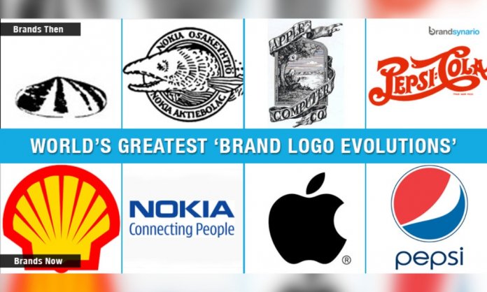
One of the biggest electronic and technology brands in the world, Apple has made a name for itself with products like Macintosh, iPad and iPhone. All these products are very different in nature but have one thing in common the elegant half bitten apple designed with a gradient chrome silver look that shines proudly on these products.
However the journey for this logo was not an easy one, the first-ever logo was a complicated design that showed Isaac Newton under a tree with the inscription “Newton … A Mind Forever Voyaging Through Strange Seas of Thought … Alone.” The logo said a lot but turned out to be a little complex for the audience.
The next attempt to revamp the design was done in 1976 and the half bitten apple was introduced in a rainbow colored theme. This logo came in the limelight for several reasons, while some believed that the logo was a tribute to the mathematician Alan Turing who committed suicide by glazing an Apple in cyanide while many believed that the rainbow colored theme was homage to the homosexuality of Turing.
The next logo was a monochromic version of the current logo that did quite well and paved the way for the current design.
2. Nike
Nike got the best deal when it comes to designing logos, for just $35 Caroline Davidson designed the famous swoosh for the brand with the name Nike in the background. Nike today has dropped the name from the logo in order to make the logo less crowded and pictures only a smart swoosh on its products.
However one might be amazed that it took Nike a 7 years to notice that the text was overlapping the swoosh which crowded the whole image.
3. Google
The biggest search engine today Google came to existence in 1996 by two Stanford University computer science graduates who derived the name Google from Googol (meaning 1 followed by 100 zeros). The first ever logo was created on free graphic software GIMP, in the same year the an exclamation mark was added mimicking Yahoo and finally in 1999 Stanford’s Arts professor Ruth Kedar designed a new logo which is used by the company today.
4. Microsoft
The journey that began in 1975 for Microsoft is still going strong, like every other brand Microsoft original logo was a far different story than what it portrays today. The very first logo the result of the partnership between Bill Gates and Paul Allen, they named this partnership “Micro-Soft”. It also became the logo for the company however in the same year another logo came into the picture that had a distinctive O in it, that was referred to as “Bilbbet”, became the reason for its success for the next 12 years.
In 1987 the logo that you see today emerged and back then was termed as the Pac man-logo due to the noticeable cut in the ‘O’ this time. In 2008 Microsoft added the inscription ‘Your Potential, Our Passion’ in the design and have been using it since.
5. Nokia
The Finnish word ‘Nokia’ means a dark, furry creature, the current brand image of the company however reflects in no way to the origin of its name. The brand came into picture as a wood pulp mill which after the merger with Finnish Rubber Works sold various products from television to shoes.
Like the brand the logo has had a very different past from a fish portrayed in its design to a simple logo with inscription “Connecting People” Nokia has seen and done it all over the years.
6. Pepsi
Among all the Brands listed Pepsi has had the most eventful journey. It has gone through tremendous change since 1898 to 2014. From exotic fonts to its well known Blue and Red theme Pepsi has experiment with its logo since its inception.
Before 1950 Pepsi just played around the font in its logo but evolution hit the brand when it decided to feature its crown bottle cap as its logo in a blue and red theme with the name Pepsi Cola in scripted on it.
Another visible change took place in 1962 when Pepsi decided to drop ‘Cola’ from its logo and finally after 2003 the name ‘Pepsi’ was also dropped leaving behind only the Blue and Red globe in the logo.


