


A logo is much more than a picture or symbol. It represents what a brand stands for, how far it has come, where it wants to go, and so much more.
Over the years, brands and firms have changed their logos to be more transparent and so that their customers can relate to them better.
From Apple to Facebook, even Volkswagen to Honda and more, almost every brand has gone through drastic revamping.
Here are 10 of the world’s most famous brands and how they’re logos have changed over the years.
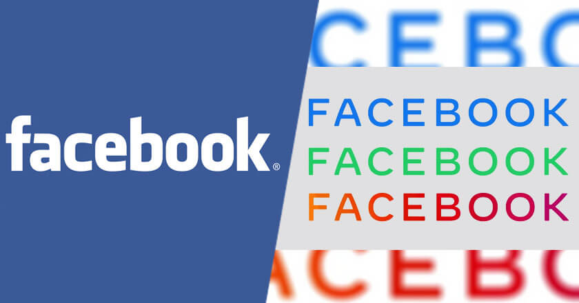
1. Facebook
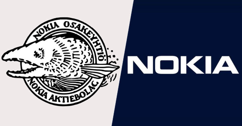
2. Nokia
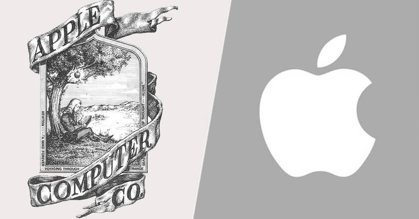
3. Apple
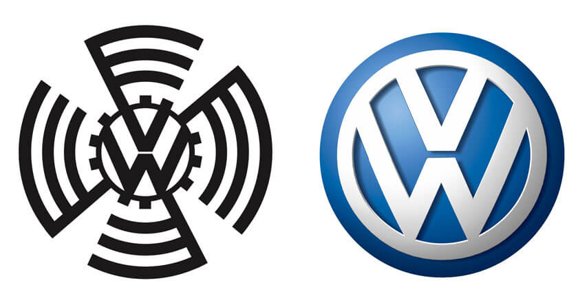
4. Volkswagen
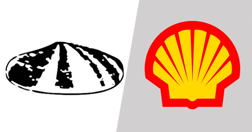
5. Shell
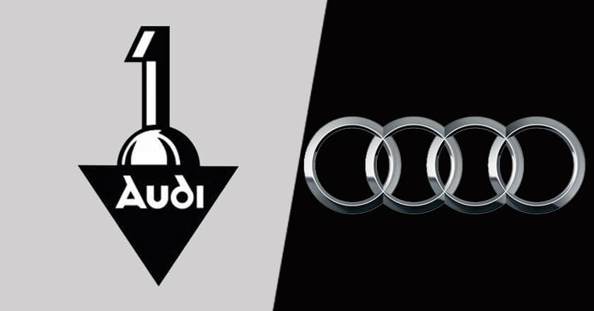
6. Audi
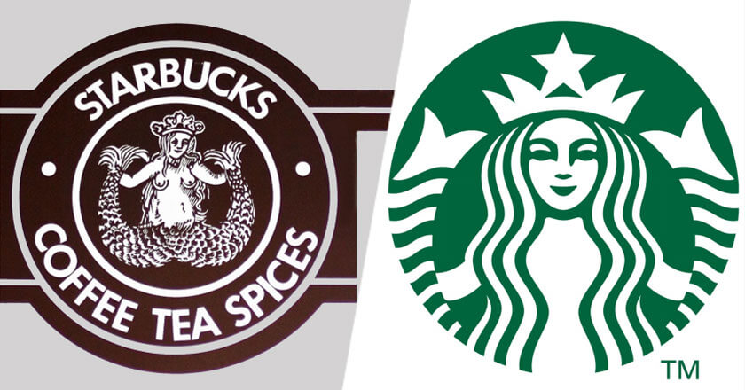
7. Starbucks
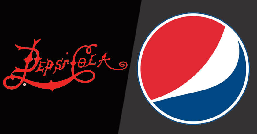
8. Pepsi-Cola
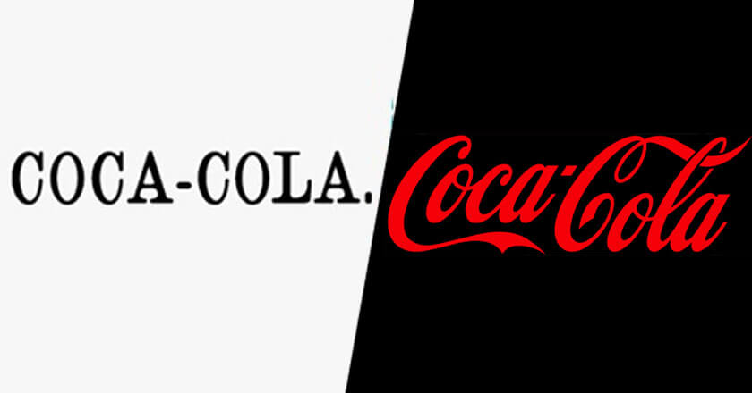
9. Coca-Cola
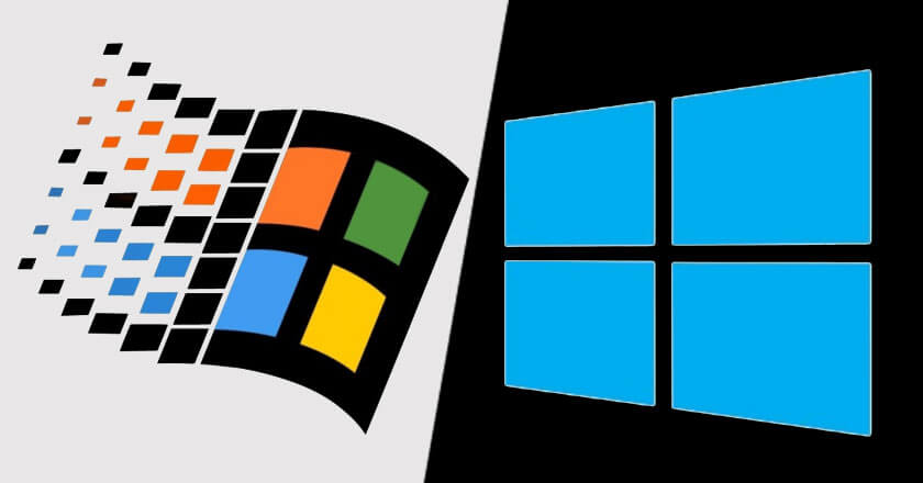
10. Windows
Revamping logos and brand identity often help save the brand. There’s always a point in time in a business where sales start to decline, and revenue stream grows thinner.
Revamping helps people understand that the brand cares about their wants and needs and encourages them to once again shift towards that brand.
Furthermore, revamping logos creates transparency between a user and a brand. Often, potential customers are missed because logos are too confusing or not easy to understand.
Thus, making them more simple, to-the-point, and readable helps a customer connect.
Often, people when searching for medicine, or a restaurant on the map refer to the logo and not the name. There might not be enough space to write ‘McDonalds’ or ‘BurgerKing’ or ‘Subway,’ but their logos can be recognized within seconds.
Last but not least, since almost 80% of the world now owns a phone, your logo needs to be optimized so that it does not appear too big, too small, blurry or pixilated when a customer is surfing through the internet.
What do you think about the concept of revamping? Share your thoughts with us in the comments below.
Stay tuned to Brandsynario for more news and updates.