By Ufaq Ashfaque
Google-owned giant video-sharing website YouTube has been an Internet phenomenon for more than seven years now. However, it has kept more or less the same persona ever since.
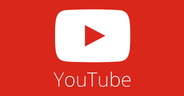
YouTube surreptitiously revealed its new logo on its social media pages along with its application platforms. The new logo features a dual tone design, with red and white colors, largely focusing on the flattened ‘Play’ icon. The font used in the fresh logo is thinner than its predecessor, with a more ‘fashionable’ tone to it.
The logo first appeared in the redesign of YouTube’s Android and iOS app last week. Ever since, the new logo has maintained a persistent appearance on the company’s Facebook and Twitter pages, however it was much discussed– why the update is not visible on YouTube’s official website.
“Our main logo is a core part of YouTube and is not going away. We are increasingly using our play button for apps and icons,” YouTube officials replied recently on these speculations
Not being changed much since its inception, YouTube’s logo, has always been a greyish-black ‘You’ followed by the word ‘Tube’ encapsulated in a red square with tapered corners. The bubble has lost some of its shine over the years.
Google’s effort of subtely rebranding its multibillion dollar venture seems understandable as the new logo is more of a symbol. YouTube has made its brand name already. The rebranding can be deemed affective as symbols are considered more valuable in advertising than words
Flattened look seems to be in fashion with Windows 8, Windows Phone and even iOS 7. Therefore YouTube’s new flattened look does echo with trend-setters of late.
YouTube still remains to be banned in Pakistan however. Therefore, YouTube applications on Smartphones do not really function.
With news of its unbanning soon, Pakistani viewers can only sit in hope to be able to use re-vamped YouTube officially again and not on proxy websites.


